I wanted to explore how people get around Chicago, and how the availability of transportation affects access to and development of various parts of the city. I used public datasets from the City of Chicago that capture spatial data on different types of transportation in the city – ‘L’ (Elevated train) lines and stops, bus stops, traffic congestion, pedestrian streets, and bike-share stations – and mapped this data over neighborhoods of Chicago in Wolfram Mathematica.
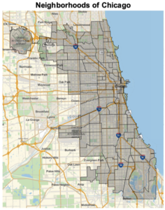
Map 0: Neighborhoods of Chicago
- This is the base dataset of every single map and is composed of neighborhood boundary data from the City of Chicago (most recently updated in 2019) with polygons representing each neighborhood.
Map 1: CTA ‘L’ Rail Lines and Stations
- This map shows approximate location data of the Chicago Transit Authority (CTA) ‘L’ rail lines and stations over the neighborhoods of Chicago.
- Two datasets, from the City of Chicago, contain the approximate locations of the rapid transit system lines (updated in 2018) and stations (updated in 2019), which are represented on the map as lines and points, respectively.

- The South and West sides of the city appear underserved by the “L”
- These neighborhoods historically have been severely underfunded
- The data used does not include information on how many people are using the ‘L’ lines and stations (ridership)
- The visualization does not do a good job of showing multiple lines that serve the same area (because they often run on the same tracks)
Map 2: CTA Bus Stops
- This map represents location data from the City of Chicago, created in 2012 and updated in 2017, of the CTA bus stops, as points, over the neighborhoods of Chicago.
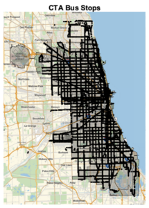
- Bus stops appear to cover a wider range of Chicago, and fill in areas that the train does not serve very well
- Lacking data on how frequently the bus lines run
- Difficult to visualize how many bus stops cover an area, because in this format they are so concentrated that they appear as lines
Map 3: Traffic Congestion by Region
- This map visualizes traffic congestion data from the City of Chicago, using an interesting dataset referred to as a “Traffic Tracker” that estimates the average observed speed in 29 regions of Chicago on arterial (non-highway) streets in real-time using GPS traces.
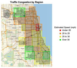
- Makes sense that the areas of Downtown Chicago around the central business district are the most congested
- I would expect the area around O’Hare International Airport (top left corner of the map) to be more congested because it is one of the busiest airports, but this might be due to the point in time the data was collected
- The data from this dataset is collected in real-time, but in this map I am pulling it from one instant in time – around 3P CST on a weekday
- This is an obvious blindspot as the exact moment in time the data is exported will affect the average speed
Map 4: Pedestrian Streets
- This map represents location data (updated in 2018) from the City of Chicago of Pedestrian Streets
- Pedestrian Streets, or “P-Streets,” are parts of streets designed for walking and proximity to shopping
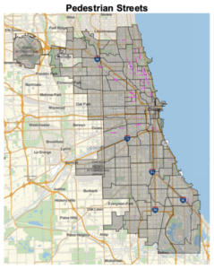
- The pedestrian streets are almost entirely clustered on the North side of the city, which is more wealthy than the South and West Sides
- Pedestrian streets are different from other modes of transit – may be utilized differently than public transit or cars
Map 5: Divvy Bike-Share Stations
- This map represents location data from the City of Chicago (updated in 2019) of Divvy bike-share stations, as points, over the neighborhoods of Chicago
- Divvy is a bike-share service with stations all over Chicago for people to ride and dock bikes
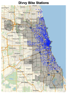
- Resembles similar trends seen in other maps – more stations concentrated in northern parts of the city and around the Loop
- Only location data is mapped – don’t get a sense of how many bikes are at each station (volume)
- Map does not provide an indication of street layout – some areas may have streets that are better or safer to bike on than others
Summary and Further Exploration:
- In general, public transportation in Chicago is concentrated around the Loop (central business district) and on the northern, more wealthy side of the city
- Certain areas appear to be underserved
- Would be interesting to incorporate non-spatial data on how riders/users use each mode
- Ex. Volume of ridership, frequency of modes, etc.
Methods
All maps were created using Wolfram Mathematica.
Map 0: Neighborhood Boundary dataset was downloaded as a KML file and converted to a polygon shape file using MyGeoData Converter.
Map 1: ‘L’ Rail Lines and ‘L’ Stations datasets were downloaded as KML files and converted into line and point shape files, respectively, using MyGeoData Converter.
Map 2: Bus stops dataset was downloaded as a KML file and converted into a point shape file using MyGeoData Converter.
Map 3: The properties of the traffic congestion data itself made assembling this map a little different. Neither a KML nor a shape file was available so the CSV file had to be used. The spatial – latitude and longitude – data was organized as four points – one coordinate representing north, south, east, and west in the csv file. In order to convert this data in csv format into geo-spatial data that could be used in Mathematica, the latitude and longitude data had to be listed in WKT format that would allow it to be interpreted as polygons with four points (see image below).
![]()
This csv file was converted into a polygon shape file using MyGeoData Converter. I color-coded the regions based on speed into 4 categories: under 20 mph, 20-25 mph, 25-30 mph, and over 30 mph.
Map 4: Pedestrian Street dataset was downloaded as a KML file and converted to a polygon shape file using MyGeoData Converter.
Map 5: The Divvy bike station data was only available in csv format. Each station had a latitude and longitude value associated with it. In order to convert it into geospatial data that Mathematica could understand, each latitude and longitude value had to be manipulated into WKT format so it could be understand as point values, similar to the process used for Map 3. This csv file was converted into a point shape file using MyGeoData Converter.
Sources
“Boundaries – Neighborhoods.” City of Chicago, Chicago Data Portal, 22 Oct. 2015, https://catalog.data.gov/dataset/boundaries-neighborhoods.
“Chicago Fire of 1871.” Encyclopædia Britannica, Encyclopædia Britannica, Inc., 1 Sept. 2018, www.britannica.com/event/Chicago-fire-of-1871.
“Chicago Traffic Tracker – Congestion Estimates by Regions.” City of Chicago, Chicago Data Portal, 19 Nov. 2011. https://data.cityofchicago.org/Transportation/Chicago-Traffic-Tracker-Congestion-Estimates-by-Re/t2qc-9pjd
“CTA Bus Stops.” City of Chicago, Chicago Data Portal, 28 Feb. 2017. https://catalog.data.gov/dataset/cta-bus-stops
“CTA – ‘L’ (Rail) Lines.” City of Chicago, Chicago Data Portal, 13 Feb. 2012. https://data.cityofchicago.org/Transportation/CTA-L-Rail-Lines-kml/sgbp-qafc
“CTA – ‘L’ (Rail) Stations.” City of Chicago, Chicago Data Portal, 13 Feb. 2012. https://data.cityofchicago.org/Transportation/CTA-L-Rail-Stations-kml/4qtv-9w43/data
“Divvy Bicycle Stations – In Service.” City of Chicago, Chicago Data Portal, 28 Jul. 2013. https://data.cityofchicago.org/Transportation/Divvy-Bicycle-Stations-In-Service/67g3-8ig8
Galland, Zoe. “How Rich Is Your Neighborhood?” Crain’s Chicago Business, 8 Jan. 2013, www.chicagobusiness.com/article/20130108/BLOGS08/130109821/map-shows-chicago-s-richest-and-poorest-neighborhoods.
MyGeodata Converter: Online GIS/CAD Data Conversion and Transformation Tool, https://mygeodata.cloud/converter/.
“Pedestrian Streets.” City of Chicago, Chicago Data Portal, 12 May 2013. https://catalog.data.gov/dataset/pedestrian-streets
Semuels, Alana. “Chicago’s Awful Divide.” The Atlantic, Atlantic Media Company, 29 Mar. 2018, www.theatlantic.com/business/archive/2018/03/chicago-segregation-poverty/556649/.